Nov172014
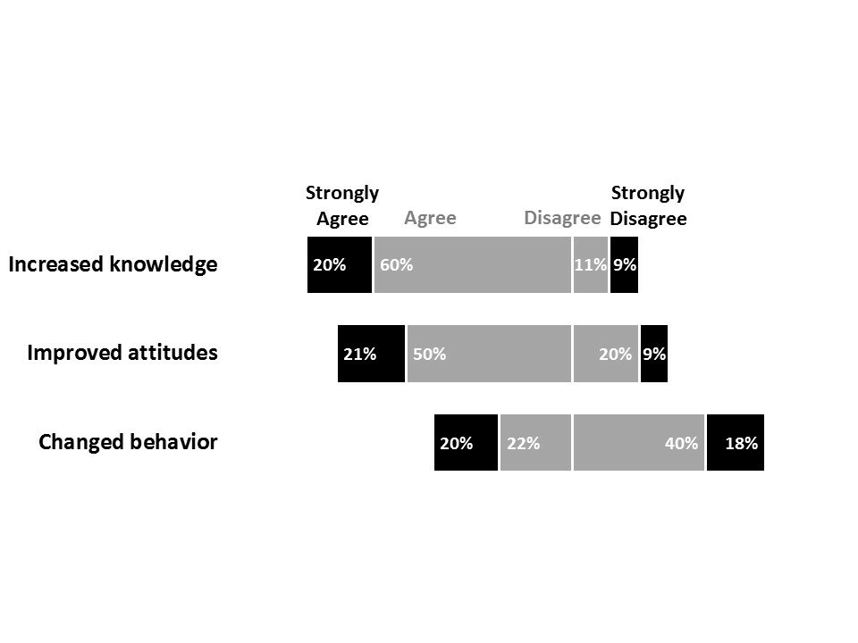
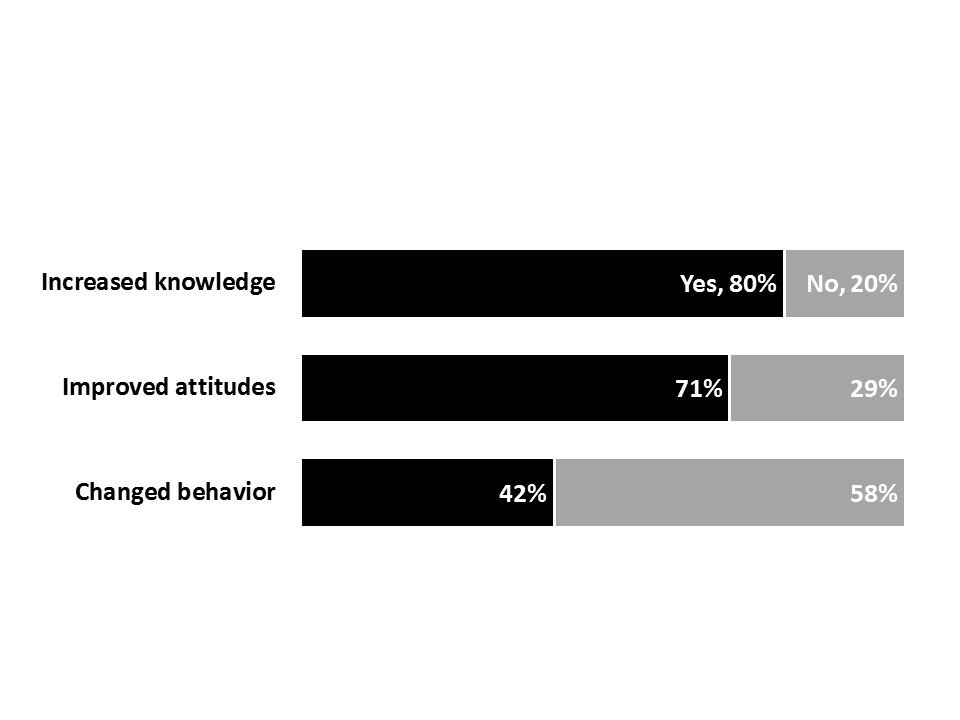
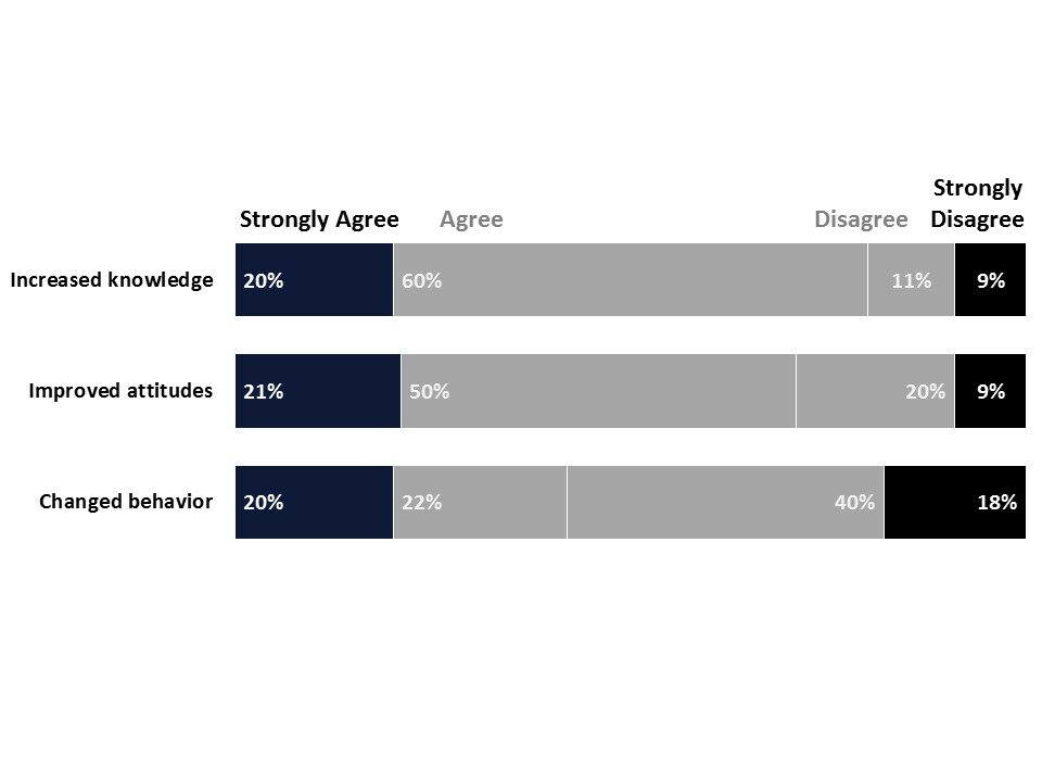
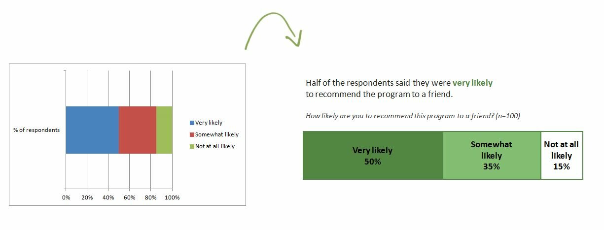
An invisible y-axis separates the good/bad, positive/negative, or agree/disagree categories. Tutorial

An invisible y-axis separates the good/bad, positive/negative, or agree/disagree categories. Tutorial


Examples: Security on land lines vs. social media: https://twitter.com/pewresearch/status/532565377143033857

Excerpt from my Kampala Evaluation Talk about data visualization from November 2014.
Each circle represents one unit of something, e.g., 10% of people. Examples: Presidential pardons: http://www.washingtonpost.com/blogs/wonkblog/wp/2014/12/18/100000-prisoners-are-in-for-low-level-drug-offenses-obama-just-gave-relief-to-8/ https://twitter.com/nytimes/status/534453455822536704 Number of female Board members: https://twitter.com/WSJGraphics/status/532678420434800640
The circle’s area represents the frequency counts. Examples: Most common types of political participation in developing countries: https://twitter.com/pewglobal/status/545588963340451840 Deaths from police shootings in Japan, Britain, Germany, and America: https://twitter.com/conradhackett/status/540240283011538945
Comments