
Here are the topics that we can cover during a 60- to 90-minute webinar. Sometimes, clients request an overview of data visualization. Other times, clients request a deep dive on a certain topic, like using color strategically in visualizations.
An abridged version of the workshop.
An abridged version of the workshop.
An abridged version of the workshop.
Pivot tables are the fastest, easiest way to make sense of spreadsheets. Whether you spend 10 percent or 100 percent of your day working with data, pivot tables are a must-have spreadsheet skill.
You’ll learn how to: design your spreadsheet to be compatible with pivot tables (e.g., prerequisites like contiguous data); create pivot tables from scratch; navigate the field list, row headers, column headers, and filters; run descriptive statistics such as averages, means, counts, and frequencies; clean data by checking for duplicates; make sure your pivot table still works even after you’re updated the raw numbers in your spreadsheet; and group items like names and dates together so that you can analyze them in aggregate.
We’ll look at several different types of datasets together, like demographic data on people from your organization’s member database and survey responses similar to your organization’s latest consumer satisfaction survey.
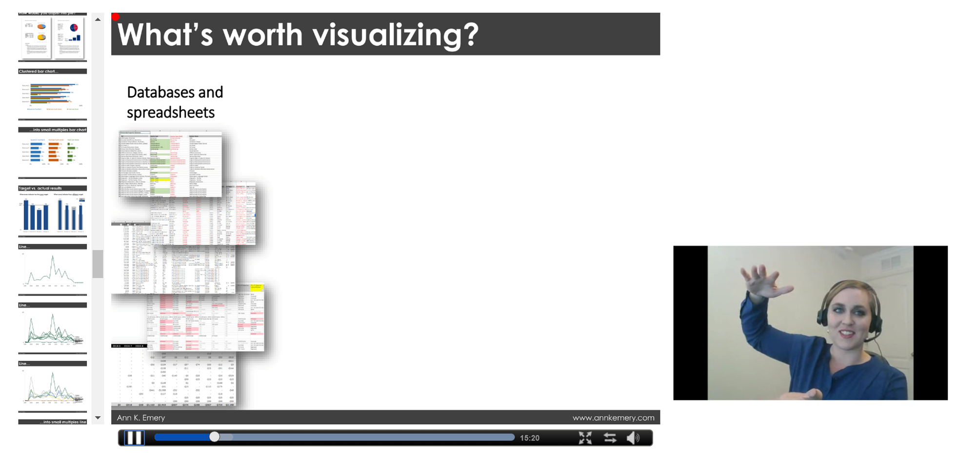
Are you ready to move beyond boring bar charts? If so, this chart-choosing session is for you. One of the first steps in the data visualization process is to select an appropriate chart type for your dataset.
You’ll learn about the pros, cons, and software tools needed for creating more than 30 different styles of charts. You’ll get exposed to new styles that are sure to make your data shine, like dot plots, small multiples layouts, Sankey diagrams, network maps, and geographic maps, as well as options for visualizing your organization’s qualitative data. This webinar will increase your data visualization vocabulary and boost your confidence in choosing correct chart types, so that your viewers will understand your data at a glance and retain information for the long run.
Adding color to graphs is simultaneously the easiest and hardest technique to nail. Color is about much, much more than making your graphs look pretty. When used well, color can enhance branding, guide viewers’ eyes to the most important pieces of the graph, and reinforce the underlying nature of the variables, all while being legible when photocopied in black and white and for people with colorblindness.
Rather than providing a broad overview of data visualization, this webinar will dive deeply into color. You’ll learn techniques for using color more strategically than you ever have before. You’ll also view before/after color makeovers from real projects so you can think about how to apply these techniques to your own work.
Have you exhausted Excel’s limited menu of graphing options?
During this session, we’ll build graphs that aren’t traditionally available within Excel. I’ll provide an overview of advanced options like dot plots, population pyramids, waffle charts, and diverging stacked bar charts. Then, you’ll choose which two or three advanced charts you want to make together in Excel.
This webinar is highly interactive; we’ll pause after each chart demonstration for hands-on practice.
You’ve got a gut feeling that your stakeholders aren’t reading your 100-page report. So what’s next?
You’ll learn about the six stages of the reporting engagement ladder, which include: Stage 1: The Dusty Shelf Report; Stage 2: A Well-Designed Report; Stage 3: The 30-3-1 Approach; Stage 4: Incorporating Additional Formats; Stage 5: Interactivity and Movement; and Stage 6: Multimedia Scrollytelling.
You’ll see real-life examples of organizations that have reached each stage of the reporting engagement ladder.
Have you ever needed to design a series of matching dashboards—one per program, school, or state? Copying and pasting can get tedious, and you’re bound to make typos. You’ll learn how to produce a series of matching dashboards without any copying and pasting.
You’ll learn a few Excel magic tricks, like creating drop-down menus and using vlookup, sumifs, and countifs to automatically populate your dashboards. This technique can save you days of day (and therefore money) and greatly reduce typos.
See the automation magic in action.
Have you ever emailed a report to stakeholders and wonder whether they even read about the data?
You’ll learn a dozen design strategies for producing more effective reports, including: the 30-3-1 Approach to Reporting; how to rearrange your Table of Contents so that your report emphasizes the results of your study; the “right” amount of visuals per page; how to arrange content within a grid system; text hierarchies; strategic column widths; and intentional page breaks. Graphic designers have been using these techniques for years, and now their graphic design secrets are available to you, too.
Have you tried presenting graphs during in-person meetings only to watch attendees’ eyes glaze over?
You’ll learn a dozen techniques for delivering an effective presentation, including how to: craft your presentation’s story so that it sticks; include visuals like icons, photographs, and graphs to make your content more memorable (and where to locate high resolution images and icons; color-code your content so that your audience knows when a new chapter is beginning; set up the presentation room for success; address audience questions (even when you don’t know the answer); and storyboard your slides so that your story shines.
Do your stakeholders believe your data? If not, you need to increase their buy-in. Sharing preliminary results through data placemats makes your data more likely to be understood, interacted with, and used.
You’ll learn about the three phases of the data placemat process. In Phase One, you analyze your data and display preliminary findings in one-pagers called data placemats. We’ll share examples of real data placemats so that you’ll know exactly how to best format your placemat’s graphs, diagrams, and tables. In Phase Two, you facilitate a data interpretation meeting and walk your stakeholders through the process of interpreting the data in their own words. We’ll share our favorite discussion-starter questions so you’ll know exactly how to guide this conversation. Finally, in Phase Three, you collect and analyze additional data (if needed) and design your final product, like a report or a slide deck.
This session is based on Ann’s article.
Read the reviews, skim the book, and contact me.