Tag archive for Span Charts

#DayDohViz: Play-Doh as a Tool for Data Visualization

#DayDohViz: Play-Doh as a Tool for Data Visualization

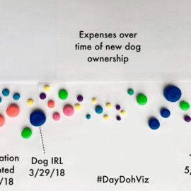
I often write about practical software how-tos. But at my core, I’m software-agnostic. I don’t care which software program you choose. I’ve seen stellar visualizations in good ol’ Excel and downright embarrassing visualizations in fancier software programs whose salespeople pretend that their software is a…

Continue reading →

Span Charts: When You’ve Only Got the Min and Max

Span Charts: When You’ve Only Got the Min and Max

A few months ago I received a copy of the Chronicle of Philanthropy. An article about nonprofit CEO salaries caught my attention. Let’s zoom in and check out that data table: Nevermind that the data (salary ranges) has nothing to do with the article (turnover)….

Continue reading →

Related Links:

Togel178

Pedetogel

Sabatoto

Togel279

Togel158

Colok178

Novaslot88

Lain-Lain

Partner Links