Tag archive for Histograms

How to Enter Your Custom Color Codes in Excel

How to Enter Your Custom Color Codes in Excel

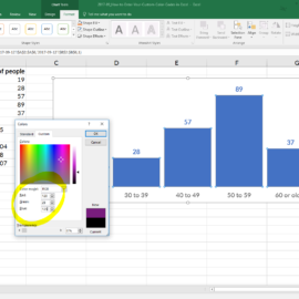
If you want to look polished, then you have no other choice but to customize your visualization’s color palette. Don’t worry–customizing your colors is an easy low-hanging-fruit edit. Locate your style guide, scroll down to the color section, and decode the jargon. If you don’t…

Continue reading →

How to Adjust Your Bar Chart’s Spacing in Excel

How to Adjust Your Bar Chart’s Spacing in Excel

Let’s pretend you’re graphing age distributions for a given county. You carefully formatted your histogram: you removed the border, lightened the grid lines, wrote a descriptive title and subtitle, selected customized RGB color codes, and called attention to a section of the graph with the saturated action…

Continue reading →

Disaggregating with Small Multiples

Disaggregating with Small Multiples

Los Angeles, San Francisco, Denver, Buffalo, Indianapolis, Milwaukee, Kampala, DC… it’s been a wonderful few months in the data visualization workshop world!   My favorite part of data visualization workshops? The airports. Kidding. Watching jaws drop when folks are introduced to small multiples layouts for…

Continue reading →

Dataviz Challenge #6: Can You Make a Unit Chart?

Dataviz Challenge #6: Can You Make a Unit Chart?

Lately I’ve been feeling let down by summary statistics: the min and max, mean and median, quartiles and standard deviation… They do their job well enough. Summary statistics tell a summary. An aggregate story, bringing all the messy scores together into some sort of cohesion. We…

Continue reading →

Related Links:

Togel178

Pedetogel

Sabatoto

Togel279

Togel158

Colok178

Novaslot88

Lain-Lain

Partner Links