Archive for Essential Charts

How the Sketching Process Works

How the Sketching Process Works

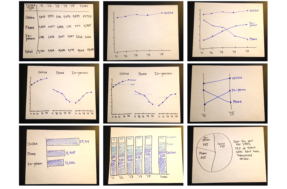
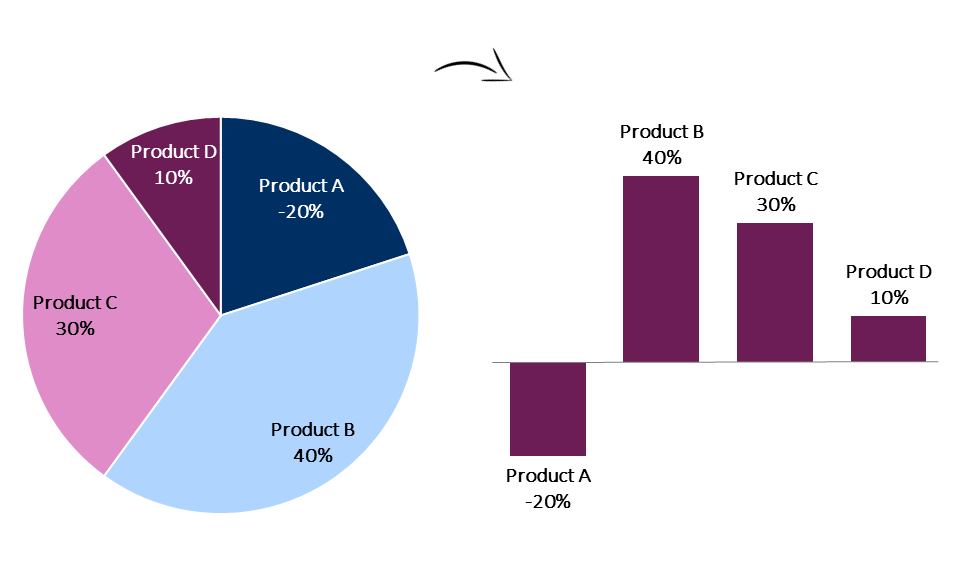
I’m back from a brief blogging break! I’ve spent the past few months speaking and designing – mainly designing. The reports and slideshows I’ve consulted on are starting to be published and it’s been so rewarding to watch organizations’ drafts transform into well-articulated masterpieces.   A…

Continue reading →

When Pie Charts Are Okay (Seriously)

When Pie Charts Are Okay (Seriously)

Within the past year, I’ve led 60+ in-person and virtual workshops for 2,800+ participants. Most of these trainings have focused on data visualization best practices and how-to’s; other topics have included dashboard automation, research methods, and data analysis. I can always tell when someone has…

Continue reading →

Introducing the Essentials, a Chart Choosing Tool

Introducing the Essentials, a Chart Choosing Tool

Last summer, my husband was traveling for work and I had the house to myself for an entire week. I could’ve binge-watched Sex and the City or eaten crumbly crackers in bed, his one-and-only marriage deal breaker. Instead, I designed my own chart taxonomy (while…

Continue reading →

Heat Table How-To in Excel

Heat Table How-To in Excel

Just because I adore graphs doesn’t mean that I shun data tables. I insert the occasional table inside the body of my report, and each report’s appendices are full of tables, tables, and more tables. When creating traditional tables, I follow the Dark Horse Analytics guide….

Continue reading →

Six Alternatives to the Clustered Bar Chart

Six Alternatives to the Clustered Bar Chart

We can all agree that 3-d exploding pie charts are pretty rotten. My vote for worst chart? The clustered bar chart. I see clustered bar charts everywhere. E-V-E-R-Y-W-H-E-R-E. On pages 1, 2, 3, 4, 5, 6, 7, 8, 9, and 10 of reports. In slides 1, 2, 3,…

Continue reading →

Page 1 of 3 1 2 3

Related Links:

Togel178

Pedetogel

Sabatoto

Togel279

Togel158

Colok178

Novaslot88

Lain-Lain

Partner Links