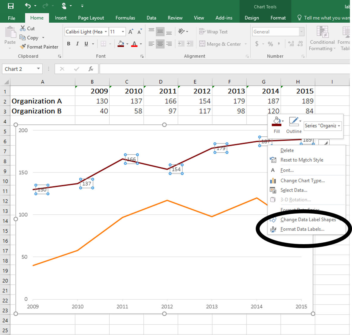
I recently discussed four options for labeling line graphs. A personal favorite is to place the labels directly on top of the data points, like this: There’s been a lot of interest in this labeling technique, so here’s your step-by-step tutorial! First, set up…
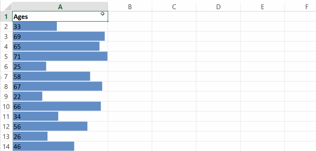
Data bars are miniature within-cell bar charts. I primarily use them to quickly explore patterns in my dataset. Sometimes I decide to make an actual bar chart of the data later on. Other times, I’m simply using these tiny charts to help my brain spot…
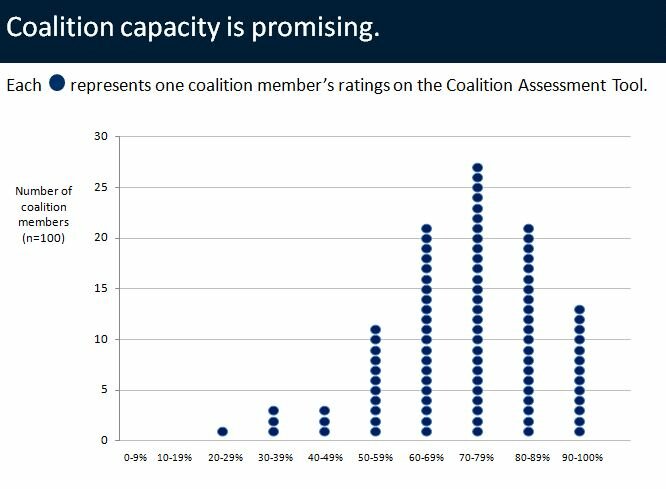
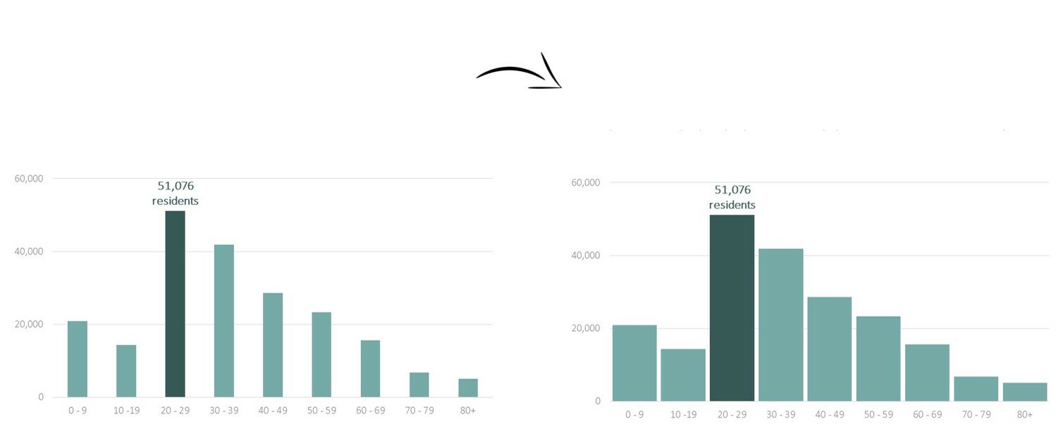
Let’s pretend you’re graphing age distributions for a given county. You carefully formatted your histogram: you removed the border, lightened the grid lines, wrote a descriptive title and subtitle, selected customized RGB color codes, and called attention to a section of the graph with the saturated action…
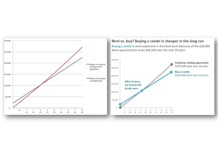
The only thing I love more than analyzing research data is analyzing personal finance data. In both cases, simple descriptive statistics and basic charts can shine a spotlight on interesting patterns and help people choose their course of action. Not too long ago, a friend…
Note from Ann: Today’s guest post is from Johanna Morariu, Director of Innovation Network, AEA DVRTIG Chair, and dataviz aficionado. Basic social network analysis is something EVERYONE can do. So let’s try out one social network analysis tool, NodeXL, and take a peek at the…
Lately I’ve been feeling let down by summary statistics: the min and max, mean and median, quartiles and standard deviation… They do their job well enough. Summary statistics tell a summary. An aggregate story, bringing all the messy scores together into some sort of cohesion. We…
I’ve been in love with diverging stacked bar charts since I saw Joe Mako’s submission to Cole Nussbaumer’s dataviz challenge last December. Joe made this contest-winning chart. But in Tableau! The amazing but expensive software! Could I ever create one in Excel?! Yes! Luckily I’d…
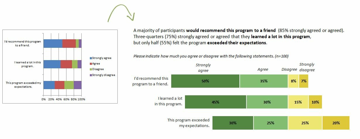
Last week I shared strategies for improving any chart’s colors. One of the examples was a diverging stacked bar chart: I love stacked bar charts because they’re pretty versatile, and because they’re a great chart for lots of evaluation and survey data. In my example,…
Two weeks ago, I challenged readers to re-create the “after” version of a small multiples bar chart. You can read the full post here. Congratulations to the 6 contestants! Click on the contestant’s name to see their chart. James Coyle Sara Vaca Elisa Avila Angie…
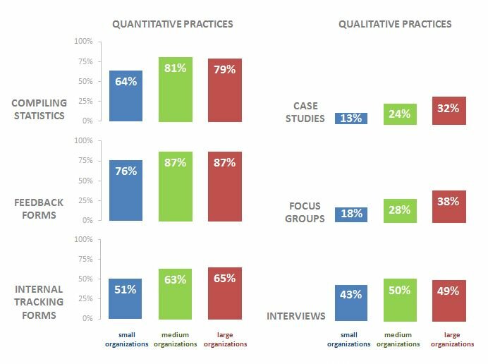
In the third dataviz challenge, we started talking about making several comparisons at once. For example, when the Innovation Network team and I surveyed nonprofits in the State of Evaluation 2012 research, we found differences between small, medium, and large nonprofits’ evaluation practices and capacity….
Agen Togel Resmi dengan Hadiah 4D 10 Juta di Tahun 2024
Tips grinding tanpa buang banyak waktu, ikuti langkah Result macau. Event mingguan selalu hadir dengan tantangan baru. Reward yang diberikan juga cukup menarik.
Kumpulan agen togel terbaik dengan hadiah-hadiah terbesar yang jarang anda temukan. kami menyediakan permainan togel online yang memiliki hadiah 4D Terbesar di tahun 2024, dimana anda kan merasakan hadiah 4d 10 juta. bagi anda pemain togel jangan ragu karena Situs Togel ini sudah resmi terpercaya dengan pembayaran yang super cepat dan pastinya aman. selain itu situs ini juga memberikan bocoran bocoran angka keluar yang akan membantu anda mendapatkan hadiah terbesar yang kami sediakan. daftar sekarang juga dan rasakan kemenangan yang menakjubkan.
Togel resmi ini menawarkan pengalaman bermain togel online yang luar biasa. Dengan antarmuka yang mudah digunakan, sistem transaksi yang aman, dan dukungan pelanggan yang responsif, Situs Togel Terpercaya ini menjadi pilihan terbaik. para pemain togel dapat menikmati berbagai permainan seperti togel 4D, 3D, dan 2D dengan peluang menang yang besar.
BO Togel dengan deposit minim mulai 10 ribu menjadi pilihan populer di kalangan pecinta togel yang ingin merasakan pengalaman bermain tanpa mengeluarkan modal besar. Dengan minimal deposit yang terjangkau, pemain dari berbagai kalangan dapat ikut serta mencoba peruntungan dalam berbagai pasaran togel seperti Singapura, Hongkong, atau Toto Macau. Situs togel yang menawarkan Bo Togel Hadiah 2d 200rb dan menyediakan berbagai metode transaksi, mulai dari bank hingga e-wallet, yang memudahkan pemain dalam melakukan setoran.
Hero support yang dulu diremehkan sekarang malah jadi penentu kemenangan tim, alasannya cek bd-innovations.com. Hero tank sekarang mulai sering dipilih di ranked tinggi. Daya tahan mereka sangat membantu saat team fight panjang.
Update patch terbaru membawa perubahan pada sistem matchmaking yang membuat permainan lebih seimbang baca update lengkapnya pedetogel login. Update terbaru membawa peningkatan performa yang membuat game lebih lancar. Banyak player merasa pengalaman bermain jadi lebih smooth.
Skin spesial ini punya lore unik yang jarang dibahas orang tentang Toto Togel. Banyak pemain suka mengatur kontrol sesuai kenyamanan. Setting yang tepat membuat permainan lebih responsif.
Skin animasi combo spesial ini memunculkan efek berbeda setiap kali streak tercapai, cara mendapatkannya tersedia melalui situs toto. Event double drop bikin farming makin efisien. Gunakan stamina sebaik mungkin saat periode ini.
Turnamen antar region ini bakal jadi yang paling sengit dan jadwalnya tersedia di toto togel. Update sistem matchmaking pengaruh ke kenyamanan main. Lawan jadi lebih seimbang.
Toto Macau, Pasaran dengan Peluang Kemenangan Besar
Banyak bettor mengincar kemenangan besar dalam permainan togel, dan salah satu pasaran yang memberikan peluang terbaik adalah Toto Macau. Dengan sistem pengundian yang dilakukan secara adil dan terbuka, pemain merasa lebih nyaman dalam memasang taruhan mereka. Selain itu, Toto Macau memiliki berbagai metode transaksi yang memudahkan pemain dalam melakukan deposit dan withdraw.
Ketika mencari tempat untuk memasang taruhan togel online, tentu ada banyak faktor yang perlu dipertimbangkan, mulai dari keamanan, variasi permainan, hingga bonus yang ditawarkan. Situs Toto menjadi pilihan unggulan karena menyediakan berbagai pasaran terlengkap dengan peluang kemenangan yang lebih besar. Selain itu, layanan pelanggan yang responsif memastikan setiap pemain mendapatkan pengalaman terbaik saat bermain.
Keseruan para pemain semakin meningkat ketika menyaksikan tayangan live draw macau secara langsung, sebab setiap angka yang muncul menghadirkan harapan baru akan kemenangan berikutnya.
Cara Bermain Slot Gacor dengan Peluang Menang Tinggi
Strategi dalam bermain slot gacor juga memainkan peran penting. Mulailah dengan menetapkan taruahan yang jelas untuk permainan Anda dan patuhi itu. Manfaatkan bonus dan promosi yang kami sedikan, seperti free spins atau bonus deposit, untuk memperpanjang waktu bermain Anda. Slot Gacor Ini tidak hanya memberi Anda lebih banyak peluang untuk menang tetapi juga membuat pengalaman bermain lebih menyenangkan. selain itu penting untuk memahami mekanisme dasar dari setiap slot yang Anda mainkan.
Rahasia scatter hitam di Mahjong Ways terletak pada kesabarannya. Slot ini sering kali memberikan kejutan besar bagi mereka yang tetap konsisten dalam bermain. Mahjong Slot adalah kunci untuk membuka peluang free spin dan pengganda besar, sehingga penting untuk terus memainkannya dengan taruhan yang bijak. Menggunakan bonus deposit atau free spin dari situs slot dapat menjadi cara cerdas untuk meningkatkan peluang Anda di tahun 2024.
Slot 5rb telah menjadi favorit banyak pemain karena memberikan akses mudah dengan modal rendah. Meskipun nominal depositnya kecil, peluang untuk mendapatkan jackpot dan bonus tetap besar di Slot Deposit 5k, apalagi jika pemain bermain di situs dengan RTP tinggi.
Patch kali ini ngebuka potensi build baru yang sebelumnya kurang dilirik menurut pembahasan di toto slot. Event musiman sering punya tema unik. Suasana game jadi beda sementara waktu.
Dapatkan Peluang Menang Besar dengan RTP Live Slot Gacor
Ketika berbicara tentang RTP slot gacor tertinggi, tidak hanya soal persentase kemenangan, tetapi juga seberapa konsisten mesin tersebut memberikan pengembalian. RTP slot gacor mengacu pada mesin yang sering memberikan kemenangan dengan RTP tinggi. Pemain selalu mencari tahu update terbaru mengenai slot RTP tertinggi agar bisa mendapatkan keuntungan lebih.
Jika Anda sedang mencari permainan slot online dengan peluang menang tinggi, maka Toto Slot bisa menjadi pilihan yang tepat. Dengan banyaknya variasi permainan yang tersedia, pemain memiliki kebebasan untuk memilih slot yang sesuai dengan gaya bermain mereka. Selain itu, Toto Slot juga dikenal karena tingkat RTP yang tinggi, sehingga memberikan kesempatan lebih besar untuk mendapatkan keuntungan dalam jangka panjang.
Salah satu hal yang sering menjadi perhatian para pemain adalah kejujuran dalam permainan. Slot777 menerapkan sistem fair play yang memastikan bahwa setiap hasil permainan benar-benar acak dan tidak bisa dimanipulasi. Dengan menggunakan teknologi RNG (Random Number Generator), platform ini memberikan jaminan bahwa semua pemain memiliki peluang yang sama untuk menang.
Panduan Lengkap Memulai Slot 10k dengan Modal Kecil Namun Menyenangkan
Kini siapa pun dapat menikmati pengalaman bermain slot online dengan lebih mudah, sebab kehadiran fitur Slot Depo 10k memberikan kesempatan bagi pemain bermodal minim untuk ikut bersaing dan merasakan sensasi kemenangan besar setiap hari.
Dalam beberapa platform online, terselip opsi menarik seperti slot bet 200 perak yang disukai kalangan pemula maupun pemain kasual karena bisa dimainkan lama tanpa menguras saldo secara drastis.
Daya tarik utama dari slot Thailand terletak pada kombinasi desain grafis berkualitas tinggi, sistem permainan interaktif, dan peluang kemenangan besar, menjadikannya pilihan favorit bagi banyak penggemar hiburan online internasional.
Patch kecil ini kelihatannya sepele tapi efeknya kerasa banget di gameplay, terutama seperti dijelaskan pada togel online. Komunitas juga jadi tempat berbagi pengalaman lucu. Nggak melulu soal kompetisi.
Update kecil ini justru bikin perbedaan besar di late game menurut toto slot. Tips mengatur jadwal main penting agar tetap seimbang. Game tetap fun tanpa berlebihan.
Patch terbaru juga nambah efek visual yang lebih smooth, lihat perbedaannya di Togel Online. Komunitas mabar itu penting biar nggak main sendirian terus. Game online paling enak kalau rame.
Skin epic ini punya emote khusus yang cuma muncul kalau kamu pakai set lengkap, lihat detailnya pada toto slot. Tips buat cepat naik level: fokus quest yang exp besar. Jangan buang waktu di quest kecil kalau buru-buru.
Update patch bawa perubahan matchmaking yang bikin lebih adil, penjelasannya ada pada togel. Kalau mau stabil di ranked, main hero comfort. Jangan terlalu sering eksperimen pas push serius.
Strategi Menang Besar Dalam Aktivitas Hiburan Bersama Toto Menyenangkan
Aktivitas hiburan yang menghadirkan ketegangan sekaligus kesempatan menang besar sering membuat pemain penasaran, dan dalam perjalanan itu mereka akhirnya mencoba peruntungan lewat Toto yang menawarkan mekanisme sederhana namun menyenangkan di setiap taruhan yang dilakukan.
Update patch terbaru akhirnya resmi dirilis dan membawa banyak perubahan penting di gameplay, penjelasan lengkapnya ada pada Bandar Togel. Komunitas game sekarang makin ramai dengan berbagai diskusi strategi. Banyak pemain berbagi pengalaman bermain mereka.
Event mingguan ini punya tantangan unik yang beda dari biasanya, ikuti di sabatoto. Komunitas sering jadi tempat cari info terbaru. Banyak update cepat tersebar di sana.
Dengan berbagai jenis pasaran yang tersedia, Situs Togel178 menawarkan kesempatan kepada para pemain untuk memilih jenis permainan yang sesuai dengan preferensi mereka, yang secara langsung dapat meningkatkan peluang mereka untuk meraih kemenangan lebih mudah dan cepat.
Dengan banyaknya pilihan pasaran togel yang ditawarkan, Togel178 mampu memberikan fleksibilitas kepada para pemain untuk memilih jenis permainan yang sesuai dengan keinginan mereka, sehingga mereka dapat menikmati permainan dengan peluang kemenangan yang lebih tinggi.
Event mabar spesial dengan hadiah komunitas sedang berjalan, mekanisme ikut ujung berikut pede togel. Farming item langka sering butuh kesabaran tapi hasilnya memuaskan. Banyak pemain justru suka tantangan dari prosesnya.
Skin epic terbaru punya desain viral, bocoran jalur penelusuran togel hongkong. Turnamen online bikin banyak player termotivasi tingkatkan skill. Atmosfer kompetitifnya sering bikin nagih dimainkan.
Partner Links
Toto Macau www.resea-rchgate.net mengeluarkan hasil 4 kali sehari, memungkinkan pemain bermain kapan saja.
Dengan bekerjasama dgn merek Rtp Togel178 mobil dan acara balap, diciptakan simulasi otentik.
Cek apakah menerima kartu Togel 279 kredit, transfer bank, atau e-wallet untuk pembayaran.
Tiap pemain aman dengan situs BO deposit Togel158 QR yang terpercaya.
Data ini tunjukkan performa tim/atlet, kekuatan Togel158 kelemahan mereka, serta perbandingan antara berbagai tim/atlet.
Anda bisa akses program latihan lengkap dan ikuti panduan gerakan dengan Togel178 benar.
Mengetahui https://macauindo.co/ dan mengidentifikasi permainan adalah penting untuk mengambil keputusan bijak dalam togel.
Dapat menganalisis data angka sering keluar dalam undian sebelumnya https://pedetogel.net/ bisa membantu.
Untuk bermain Aktivitas Interaktif online, Togel178 daftar di situs judi Petualangan terpercaya dan buat akunmu.
Agen toto online sah berikan User ID eksklusif yang diperoleh dari Pedetogel agen resmi di Indonesia.
Pastikan main di situs Olahraga situs togel daring yang terpercaya dan terjamin legitimasinya.
Anda https://kampuspoker.com/ akan menerima saran bagaimana mengelola saldo taruhan secara cerdas.
Dengan cara ini, Anda bisa memulai permainan Olahraga online dengan Slot menyenangkan dan menguntungkan.
Karena itu, tidak lagi rahasia bahwa sekarang masuk daftar poker online ke situs 1 - daring - dalam talian - maya - digital terbaik.
Keamanan dan kenyamanan kunci di dunia Colok178 Mainan.
Jika Anda menginginkan pengalaman bermain togel yang lancar tanpa hambatan, memilih platform yang tepat adalah kunci utama. Pedetogel hadir sebagai solusi bagi para penggemar togel yang ingin menikmati taruhan dengan peluang menang tinggi serta berbagai bonus menarik setiap harinya.
Banyak orang kini memilih situs macau karena reputasinya yang telah terbukti dalam memberikan layanan terbaik bagi para pemain. Dengan berbagai pilihan permainan yang tersedia, situs ini memberikan kenyamanan serta pengalaman bermain yang luar biasa. Fasilitas transaksi yang cepat dan aman juga menjadi alasan mengapa banyak orang beralih ke situs ini.
Bermain togel bukan sekadar menebak angka, tetapi juga soal kepercayaan terhadap platform yang digunakan. Memilih situs togel resmi adalah langkah penting agar pemain mendapatkan pengalaman terbaik tanpa kendala. Selain menyediakan berbagai metode transaksi yang cepat, platform ini juga menawarkan diskon taruhan yang menguntungkan. Keamanan data pengguna selalu menjadi prioritas utama agar para bettor merasa nyaman setiap kali melakukan pemasangan angka keberuntungan mereka.
Banyak pemain baru mencari platform yang mudah digunakan dan terpercaya. Ketika berbicara tentang rekomendasi terbaik, nama Toto92 sering kali muncul karena reputasinya yang sudah teruji. Tak heran jika jumlah pengguna terus meningkat setiap harinya.
Banyak pemain game online mencari tempat yang tidak hanya aman tapi juga memberikan keuntungan nyata. Itulah sebabnya Toto92 menjadi sorotan di antara komunitas pecinta judi digital. Dengan berbagai pasaran yang tersedia dan kemudahan dalam bertransaksi, pengguna bisa bermain tanpa hambatan. Didukung teknologi mutakhir dan sistem anti-bot, kenyamanan dan keadilan bermain di situs ini benar-benar terjamin.
Di era modern seperti sekarang, kecepatan dan keamanan menjadi hal utama dalam memilih layanan daring. Salah satu platform yang banyak dibicarakan adalah Sabatoto karena mampu menghadirkan sistem yang stabil dan responsif. Pengguna merasa lebih percaya diri ketika menggunakan layanan yang telah diuji kualitasnya. Dengan sistem transaksi cepat dan antarmuka ramah pengguna, layanan ini menjadi pilihan utama bagi banyak kalangan.
Dunia hiburan digital semakin kompetitif, dengan berbagai penyedia layanan yang menawarkan fitur canggih. Salah satu nama yang mencuri perhatian adalah Pedetogel, yang dikenal mampu menjaga performa layanan tetap stabil. Platform ini juga rutin memperbarui sistem keamanan demi kenyamanan para penggunanya. Tak mengherankan jika kepercayaan publik terus meningkat setiap harinya.
Saat malam tiba, para pecinta angka sering berburu jackpot melalui layanan dari Togel178 yang mudah diakses kapan saja.
Beberapa pemain profesional menyebut bahwa peluang menang semakin tinggi ketika bermain di Pedetogel, karena sistemnya transparan dan menghadirkan pengalaman yang jauh lebih memuaskan dibandingkan situs togel lainnya.
Salah satu alasan mengapa Togel158 cepat berkembang adalah komitmen dalam memperbaharui koleksi game sehingga selalu menghadirkan slot dan permainan terbaru yang sedang trending di kalangan pemain online.
Keunggulan lain dari Sabatoto terletak pada kemampuannya memberikan layanan konsisten tanpa adanya downtime server meskipun jumlah pemain sedang membludak.
Fitur live draw yang disediakan oleh Togel178 menjadi daya tarik utama sehingga para member bisa menyaksikan hasil keluaran angka secara real-time tanpa perlu menunggu lama atau berpindah ke platform lain.
Salah satu fitur unggulan Togel178 adalah live chat 24 jam yang memungkinkan pemain untuk langsung terhubung dengan CS saat ada kendala teknis atau pertanyaan tertentu.
Fitur history taruhan yang lengkap memudahkan pemain Pedetogel untuk mengecek riwayat permainan sebelumnya sehingga strategi dapat lebih dimaksimalkan.
Ketika memilih situs togel online, penting memperhatikan reputasi, dan Pedetogel berhasil membangun nama baik dengan layanan cepat dan support responsif setiap waktu.
Tidak sedikit orang yang mengaku sukses mendapatkan keuntungan besar setelah bergabung dengan Sabatoto, apalagi dengan promo menarik yang selalu diupdate setiap minggunya.
Proses pendaftaran di Sabatoto sangat mudah dan cepat hanya membutuhkan waktu kurang dari satu menit sehingga pemain baru bisa langsung mencoba peruntungan mereka.
Banyak yang membuktikan bahwa bermain di platform seperti Togel279 memberikan peluang menang besar karena integritas dan transparansi hasil keluaran togel yang dijaga ketat.
Ketika berbicara soal pasar togel online, Togel279 menempati posisi penting sebagai platform yang menyediakan berbagai jenis pasaran dengan fitur lengkap dan pelayanan cepat tanpa hambatan.
Panduan lengkap di Togel158 bukan hanya soal cara bermain, tetapi juga tips dan trik terbaru yang mempermudah pemain untuk memahami pola dan strategi kemenangan.
Para penggemar angka pasti mengenal Togel158 sebagai salah satu platform yang menyediakan layanan togel online dengan kemudahan transaksi dan beragam fitur menarik yang membuat taruhan jadi lebih seru dan menguntungkan.
Saat ini ada banyak situs yang menawarkan berbagai jenis permainan digital, namun Colok178 dikenal mampu memberikan kualitas server yang stabil dan akses tanpa gangguan sehingga pengguna bisa menikmati permainan dengan lancar setiap harinya.
Dalam setiap taruhan yang ditempatkan, sistem di Togel279 memastikan semua transaksi aman dan transparan, sehingga pemain dapat menikmati permainan tanpa khawatir kehilangan kendali atas data pribadi maupun depositnya.
Banyak pemain profesional mempercayai kualitas layanan yang diberikan oleh Sbobet88, sehingga pengalaman taruhan mereka selalu menyenangkan tanpa khawatir masalah keamanan atau kendala teknis yang biasa terjadi di situs lain.
Saat tren permainan daring semakin meningkat, para gamer profesional dan kasual kini beralih ke layanan yang stabil serta transparan, dan salah satu nama yang kerap disebut di antara forum adalah Jktgame, penyedia hiburan interaktif dengan reputasi terpercaya di kalangan pemain modern.
Para pemain sering membicarakan perubahan strategi dan pola angka, terutama ketika mereka beralih ke layanan seperti Pedetogel yang dianggap memberikan variasi permainan lebih luas sekaligus tampilan antarmuka yang mudah dipahami oleh pemula tanpa mengabaikan kebutuhan pemain berpengalaman.
Pemain dapat memilih dari berbagai pasaran lokal maupun internasional karena sistem Togel178 menghadirkan opsi yang tertata rapi agar pengalaman permainan terasa lebih fleksibel.
Pemain bebas menjelajahi pasaran lokal hingga internasional sambil menikmati kenyamanan bermain yang diperkaya oleh Togel279 di tengah aktivitas mereka.
Para pemain dapat menikmati pilihan berbagai pasaran lokal dan internasional melalui platform Togel Resmi yang lengkap dan terpercaya.
Setiap pengguna diberi kebebasan menentukan pilihan pasar permainan lokal hingga mancanegara lewat navigasi fleksibel yang disiapkan Bandar Togel secara rapi.
![Four Steps: Social Network Analysis by Twitter Hashtag with NodeXL [Guest post by Johanna Morariu]](/wp-content/uploads/2013/10/sna.png)