
Here are the topics that we can cover during a 60- to 90-minute webinar. Sometimes, clients request an overview of data visualization. Other times, clients request a deep dive on a certain topic, like using color strategically in visualizations.
An abridged version of the workshop.
An abridged version of the workshop.
An abridged version of the workshop.
Pivot tables are the fastest, easiest way to make sense of spreadsheets. Whether you spend 10 percent or 100 percent of your day working with data, pivot tables are a must-have spreadsheet skill.
You’ll learn how to: design your spreadsheet to be compatible with pivot tables (e.g., prerequisites like contiguous data); create pivot tables from scratch; navigate the field list, row headers, column headers, and filters; run descriptive statistics such as averages, means, counts, and frequencies; clean data by checking for duplicates; make sure your pivot table still works even after you’re updated the raw numbers in your spreadsheet; and group items like names and dates together so that you can analyze them in aggregate.
We’ll look at several different types of datasets together, like demographic data on people from your organization’s member database and survey responses similar to your organization’s latest consumer satisfaction survey.
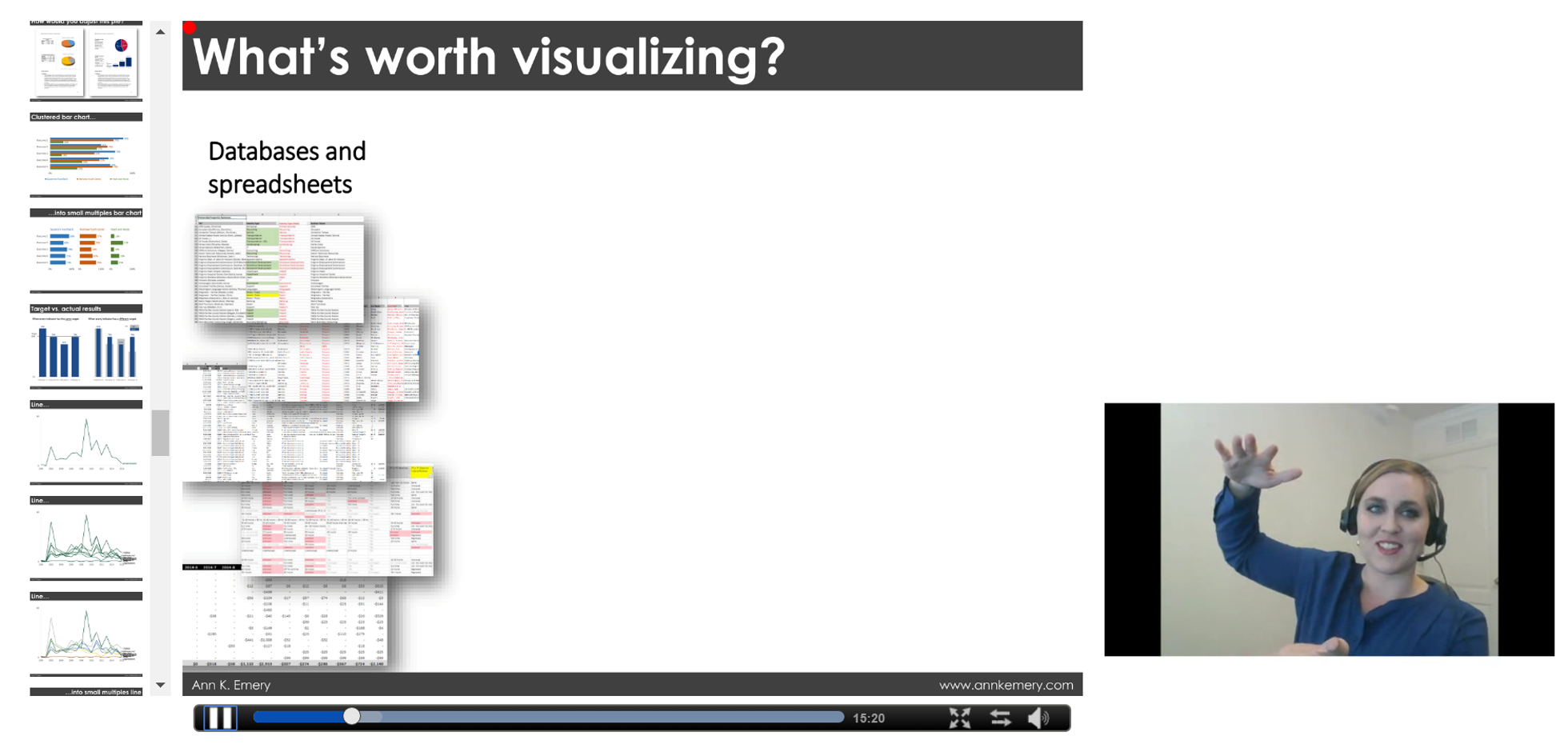
Are you ready to move beyond boring bar charts? If so, this chart-choosing session is for you. One of the first steps in the data visualization process is to select an appropriate chart type for your dataset.
You’ll learn about the pros, cons, and software tools needed for creating more than 30 different styles of charts. You’ll get exposed to new styles that are sure to make your data shine, like dot plots, small multiples layouts, Sankey diagrams, network maps, and geographic maps, as well as options for visualizing your organization’s qualitative data. This webinar will increase your data visualization vocabulary and boost your confidence in choosing correct chart types, so that your viewers will understand your data at a glance and retain information for the long run.
Adding color to graphs is simultaneously the easiest and hardest technique to nail. Color is about much, much more than making your graphs look pretty. When used well, color can enhance branding, guide viewers’ eyes to the most important pieces of the graph, and reinforce the underlying nature of the variables, all while being legible when photocopied in black and white and for people with colorblindness.
Rather than providing a broad overview of data visualization, this webinar will dive deeply into color. You’ll learn techniques for using color more strategically than you ever have before. You’ll also view before/after color makeovers from real projects so you can think about how to apply these techniques to your own work.
Have you exhausted Excel’s limited menu of graphing options?
During this session, we’ll build graphs that aren’t traditionally available within Excel. I’ll provide an overview of advanced options like dot plots, population pyramids, waffle charts, and diverging stacked bar charts. Then, you’ll choose which two or three advanced charts you want to make together in Excel.
This webinar is highly interactive; we’ll pause after each chart demonstration for hands-on practice.
You’ve got a gut feeling that your stakeholders aren’t reading your 100-page report. So what’s next?
You’ll learn about the six stages of the reporting engagement ladder, which include: Stage 1: The Dusty Shelf Report; Stage 2: A Well-Designed Report; Stage 3: The 30-3-1 Approach; Stage 4: Incorporating Additional Formats; Stage 5: Interactivity and Movement; and Stage 6: Multimedia Scrollytelling.
You’ll see real-life examples of organizations that have reached each stage of the reporting engagement ladder.
Have you ever needed to design a series of matching dashboards—one per program, school, or state? Copying and pasting can get tedious, and you’re bound to make typos. You’ll learn how to produce a series of matching dashboards without any copying and pasting.
You’ll learn a few Excel magic tricks, like creating drop-down menus and using vlookup, sumifs, and countifs to automatically populate your dashboards. This technique can save you days of day (and therefore money) and greatly reduce typos.
See the automation magic in action.
Have you ever emailed a report to stakeholders and wonder whether they even read about the data?
You’ll learn a dozen design strategies for producing more effective reports, including: the 30-3-1 Approach to Reporting; how to rearrange your Table of Contents so that your report emphasizes the results of your study; the “right” amount of visuals per page; how to arrange content within a grid system; text hierarchies; strategic column widths; and intentional page breaks. Graphic designers have been using these techniques for years, and now their graphic design secrets are available to you, too.
Have you tried presenting graphs during in-person meetings only to watch attendees’ eyes glaze over?
You’ll learn a dozen techniques for delivering an effective presentation, including how to: craft your presentation’s story so that it sticks; include visuals like icons, photographs, and graphs to make your content more memorable (and where to locate high resolution images and icons; color-code your content so that your audience knows when a new chapter is beginning; set up the presentation room for success; address audience questions (even when you don’t know the answer); and storyboard your slides so that your story shines.
Do your stakeholders believe your data? If not, you need to increase their buy-in. Sharing preliminary results through data placemats makes your data more likely to be understood, interacted with, and used.
You’ll learn about the three phases of the data placemat process. In Phase One, you analyze your data and display preliminary findings in one-pagers called data placemats. We’ll share examples of real data placemats so that you’ll know exactly how to best format your placemat’s graphs, diagrams, and tables. In Phase Two, you facilitate a data interpretation meeting and walk your stakeholders through the process of interpreting the data in their own words. We’ll share our favorite discussion-starter questions so you’ll know exactly how to guide this conversation. Finally, in Phase Three, you collect and analyze additional data (if needed) and design your final product, like a report or a slide deck.
This session is based on Ann’s article.
Read the reviews, skim the book, and contact me.
Kumpulan agen togel terbaik dengan hadiah-hadiah terbesar yang jarang anda temukan. kami menyediakan permainan togel online yang memiliki hadiah 4D Terbesar di tahun 2024, dimana anda kan merasakan hadiah 4d 10 juta. bagi anda pemain togel jangan ragu karena Situs Togel ini sudah resmi terpercaya dengan pembayaran yang super cepat dan pastinya aman. selain itu situs ini juga memberikan bocoran bocoran angka keluar yang akan membantu anda mendapatkan hadiah terbesar yang kami sediakan. daftar sekarang juga dan rasakan kemenangan yang menakjubkan.
Togel resmi ini menawarkan pengalaman bermain togel online yang luar biasa. Dengan antarmuka yang mudah digunakan, sistem transaksi yang aman, dan dukungan pelanggan yang responsif, Situs Togel Terpercaya ini menjadi pilihan terbaik. para pemain togel dapat menikmati berbagai permainan seperti togel 4D, 3D, dan 2D dengan peluang menang yang besar.
BO Togel dengan deposit minim mulai 10 ribu menjadi pilihan populer di kalangan pecinta togel yang ingin merasakan pengalaman bermain tanpa mengeluarkan modal besar. Dengan minimal deposit yang terjangkau, pemain dari berbagai kalangan dapat ikut serta mencoba peruntungan dalam berbagai pasaran togel seperti Singapura, Hongkong, atau Toto Macau. Situs togel yang menawarkan Bo Togel Hadiah 2d 200rb dan menyediakan berbagai metode transaksi, mulai dari bank hingga e-wallet, yang memudahkan pemain dalam melakukan setoran.
Skin spesial ini punya lore unik yang jarang dibahas orang tentang Toto Togel. Banyak pemain suka mengatur kontrol sesuai kenyamanan. Setting yang tepat membuat permainan lebih responsif.
Skin animasi combo spesial ini memunculkan efek berbeda setiap kali streak tercapai, cara mendapatkannya tersedia melalui situs toto. Event double drop bikin farming makin efisien. Gunakan stamina sebaik mungkin saat periode ini.
Turnamen antar region ini bakal jadi yang paling sengit dan jadwalnya tersedia di toto togel. Update sistem matchmaking pengaruh ke kenyamanan main. Lawan jadi lebih seimbang.
Banyak bettor mengincar kemenangan besar dalam permainan togel, dan salah satu pasaran yang memberikan peluang terbaik adalah Toto Macau. Dengan sistem pengundian yang dilakukan secara adil dan terbuka, pemain merasa lebih nyaman dalam memasang taruhan mereka. Selain itu, Toto Macau memiliki berbagai metode transaksi yang memudahkan pemain dalam melakukan deposit dan withdraw.
Ketika mencari tempat untuk memasang taruhan togel online, tentu ada banyak faktor yang perlu dipertimbangkan, mulai dari keamanan, variasi permainan, hingga bonus yang ditawarkan. Situs Toto menjadi pilihan unggulan karena menyediakan berbagai pasaran terlengkap dengan peluang kemenangan yang lebih besar. Selain itu, layanan pelanggan yang responsif memastikan setiap pemain mendapatkan pengalaman terbaik saat bermain.
Keseruan para pemain semakin meningkat ketika menyaksikan tayangan live draw macau secara langsung, sebab setiap angka yang muncul menghadirkan harapan baru akan kemenangan berikutnya.
Strategi dalam bermain slot gacor juga memainkan peran penting. Mulailah dengan menetapkan taruahan yang jelas untuk permainan Anda dan patuhi itu. Manfaatkan bonus dan promosi yang kami sedikan, seperti free spins atau bonus deposit, untuk memperpanjang waktu bermain Anda. Slot Gacor Ini tidak hanya memberi Anda lebih banyak peluang untuk menang tetapi juga membuat pengalaman bermain lebih menyenangkan. selain itu penting untuk memahami mekanisme dasar dari setiap slot yang Anda mainkan.
Rahasia scatter hitam di Mahjong Ways terletak pada kesabarannya. Slot ini sering kali memberikan kejutan besar bagi mereka yang tetap konsisten dalam bermain. Mahjong Slot adalah kunci untuk membuka peluang free spin dan pengganda besar, sehingga penting untuk terus memainkannya dengan taruhan yang bijak. Menggunakan bonus deposit atau free spin dari situs slot dapat menjadi cara cerdas untuk meningkatkan peluang Anda di tahun 2024.
Slot 5rb telah menjadi favorit banyak pemain karena memberikan akses mudah dengan modal rendah. Meskipun nominal depositnya kecil, peluang untuk mendapatkan jackpot dan bonus tetap besar di Slot Deposit 5k, apalagi jika pemain bermain di situs dengan RTP tinggi.
Patch kali ini ngebuka potensi build baru yang sebelumnya kurang dilirik menurut pembahasan di toto slot. Event musiman sering punya tema unik. Suasana game jadi beda sementara waktu.
Ketika berbicara tentang RTP slot gacor tertinggi, tidak hanya soal persentase kemenangan, tetapi juga seberapa konsisten mesin tersebut memberikan pengembalian. RTP slot gacor mengacu pada mesin yang sering memberikan kemenangan dengan RTP tinggi. Pemain selalu mencari tahu update terbaru mengenai slot RTP tertinggi agar bisa mendapatkan keuntungan lebih.
Jika Anda sedang mencari permainan slot online dengan peluang menang tinggi, maka Toto Slot bisa menjadi pilihan yang tepat. Dengan banyaknya variasi permainan yang tersedia, pemain memiliki kebebasan untuk memilih slot yang sesuai dengan gaya bermain mereka. Selain itu, Toto Slot juga dikenal karena tingkat RTP yang tinggi, sehingga memberikan kesempatan lebih besar untuk mendapatkan keuntungan dalam jangka panjang.
Salah satu hal yang sering menjadi perhatian para pemain adalah kejujuran dalam permainan. Slot777 menerapkan sistem fair play yang memastikan bahwa setiap hasil permainan benar-benar acak dan tidak bisa dimanipulasi. Dengan menggunakan teknologi RNG (Random Number Generator), platform ini memberikan jaminan bahwa semua pemain memiliki peluang yang sama untuk menang.
Kini siapa pun dapat menikmati pengalaman bermain slot online dengan lebih mudah, sebab kehadiran fitur Slot Depo 10k memberikan kesempatan bagi pemain bermodal minim untuk ikut bersaing dan merasakan sensasi kemenangan besar setiap hari.
Dalam beberapa platform online, terselip opsi menarik seperti slot bet 200 perak yang disukai kalangan pemula maupun pemain kasual karena bisa dimainkan lama tanpa menguras saldo secara drastis.
Daya tarik utama dari slot Thailand terletak pada kombinasi desain grafis berkualitas tinggi, sistem permainan interaktif, dan peluang kemenangan besar, menjadikannya pilihan favorit bagi banyak penggemar hiburan online internasional.
Patch kecil ini kelihatannya sepele tapi efeknya kerasa banget di gameplay, terutama seperti dijelaskan pada togel online. Komunitas juga jadi tempat berbagi pengalaman lucu. Nggak melulu soal kompetisi.
Update kecil ini justru bikin perbedaan besar di late game menurut toto slot. Tips mengatur jadwal main penting agar tetap seimbang. Game tetap fun tanpa berlebihan.
Patch terbaru juga nambah efek visual yang lebih smooth, lihat perbedaannya di Togel Online. Komunitas mabar itu penting biar nggak main sendirian terus. Game online paling enak kalau rame.
Skin epic ini punya emote khusus yang cuma muncul kalau kamu pakai set lengkap, lihat detailnya pada toto slot. Tips buat cepat naik level: fokus quest yang exp besar. Jangan buang waktu di quest kecil kalau buru-buru.
Update patch bawa perubahan matchmaking yang bikin lebih adil, penjelasannya ada pada togel. Kalau mau stabil di ranked, main hero comfort. Jangan terlalu sering eksperimen pas push serius.
Aktivitas hiburan yang menghadirkan ketegangan sekaligus kesempatan menang besar sering membuat pemain penasaran, dan dalam perjalanan itu mereka akhirnya mencoba peruntungan lewat Toto yang menawarkan mekanisme sederhana namun menyenangkan di setiap taruhan yang dilakukan.
Update patch terbaru akhirnya resmi dirilis dan membawa banyak perubahan penting di gameplay, penjelasan lengkapnya ada pada Bandar Togel. Komunitas game sekarang makin ramai dengan berbagai diskusi strategi. Banyak pemain berbagi pengalaman bermain mereka.
Event mingguan ini punya tantangan unik yang beda dari biasanya, ikuti di sabatoto. Komunitas sering jadi tempat cari info terbaru. Banyak update cepat tersebar di sana.