Tag archive for Templates - page 3

Bar Charts: Regular or Stacked?

Bar Charts: Regular or Stacked?

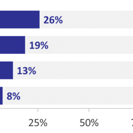
Chart choosing is part art and part science. During workshops, I cover my chart choosing thought process in more detail. For now, let me save you hours of time with this not-so-secret secret: Start with a bar chart. Then, fine-tine your bar chart. Try your…

Continue reading →

The Graph’s Scale: Actual Maximum Value or Potential Maximum Value?

The Graph’s Scale: Actual Maximum Value or Potential Maximum Value?

Fine-tune your graphs by discussing this question with your colleagues: should our graph’s axes extend to the dataset’s actual maximum value or to the potential maximum value? Option A: Axis stretches just past the actual maximum value (30% in this example) The biggest number is 26%, and…

Continue reading →

How to Adjust Your Bar Chart’s Spacing in Excel

How to Adjust Your Bar Chart’s Spacing in Excel

Let’s pretend you’re graphing age distributions for a given county. You carefully formatted your histogram: you removed the border, lightened the grid lines, wrote a descriptive title and subtitle, selected customized RGB color codes, and called attention to a section of the graph with the saturated action…

Continue reading →

Page 3 of 3 1 2 3

Related Links:

Togel178

Pedetogel

Sabatoto

Togel279

Togel158

Colok178

Novaslot88

Lain-Lain

Partner Links