Tag archive for histogram

Adjusting Your Bar Chart’s Spacing in Excel

Adjusting Your Bar Chart’s Spacing in Excel

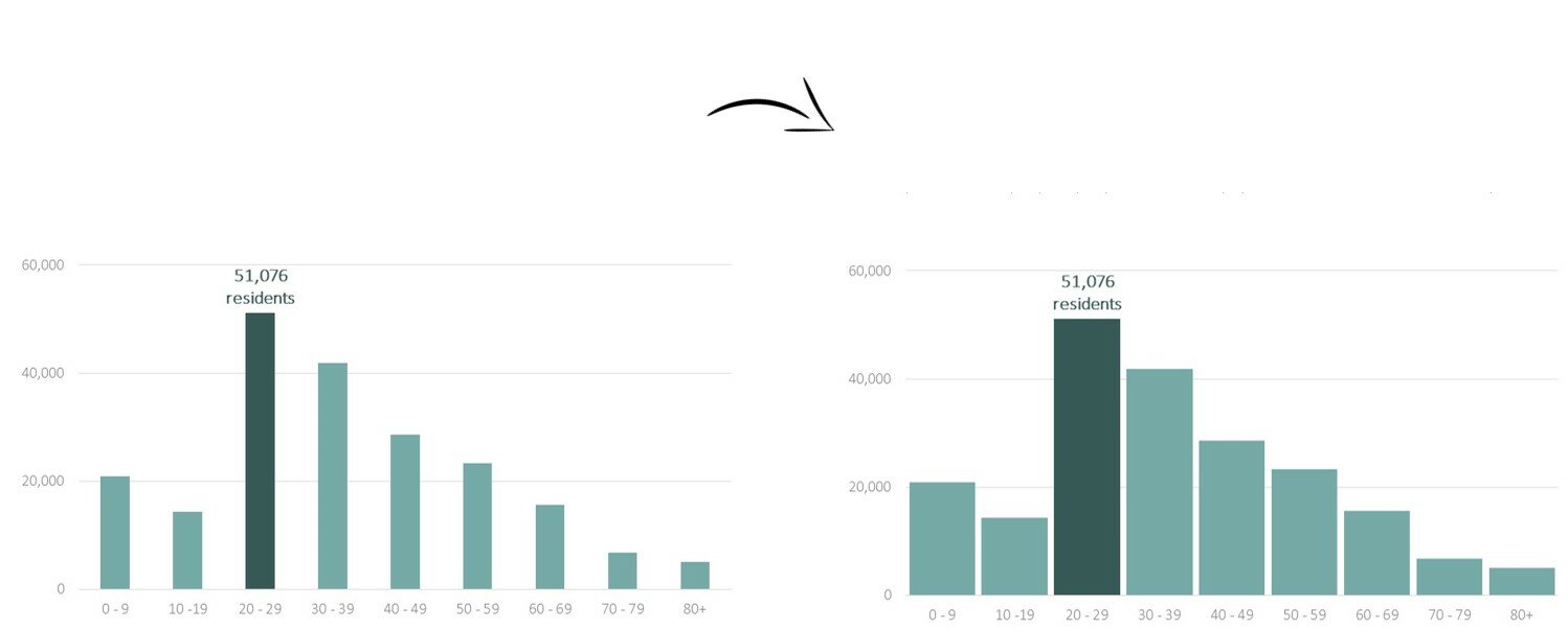
Let’s pretend you’re graphing age distributions for a given county. You carefully formatted your histogram: you removed the border, lightened the grid lines, wrote a descriptive title and subtitle, selected customized RGB color codes, and called attention to a section of the graph with the saturated action…

Continue reading →

Disaggregating with Small Multiples

Disaggregating with Small Multiples

Los Angeles, San Francisco, Denver, Buffalo, Indianapolis, Milwaukee, Kampala, DC… it’s been a wonderful few months in the data visualization workshop world!   My favorite part of data visualization workshops? The airports. Kidding. Watching jaws drop when folks are introduced to small multiples layouts for…

Continue reading →

Dataviz Challenge #6: Can You Make a Unit Chart?

Dataviz Challenge #6: Can You Make a Unit Chart?

Lately I’ve been feeling let down by summary statistics: the min and max, mean and median, quartiles and standard deviation… They do their job well enough. Summary statistics tell a summary. An aggregate story, bringing all the messy scores together into some sort of cohesion. We…

Continue reading →

Situs Togel Terpercaya Slot88 Situs Togel Prize 123 Bo Togel Terpercaya Togel Online Daftar Akun Togel Resmi Toto Macau Toto Togel Situs Togel Terpercaya Togel178 Togel279 Situs Togel Via Pulsa Tanpa Potongan Daftar Togel Via Pulsa Tanpa Potongan Toto Macau Situs Togel Bandar Togel Agen Togel Bo Togel Daftar Togel Togel279 Situs Togel Via Dana Situs Togel Prize123 Situs Togel Hadiah