Tag archive for essential charts webinar

Public Webinar: Which Chart is Best for My Data? Essential Charts

Public Webinar: Which Chart is Best for My Data? Essential Charts

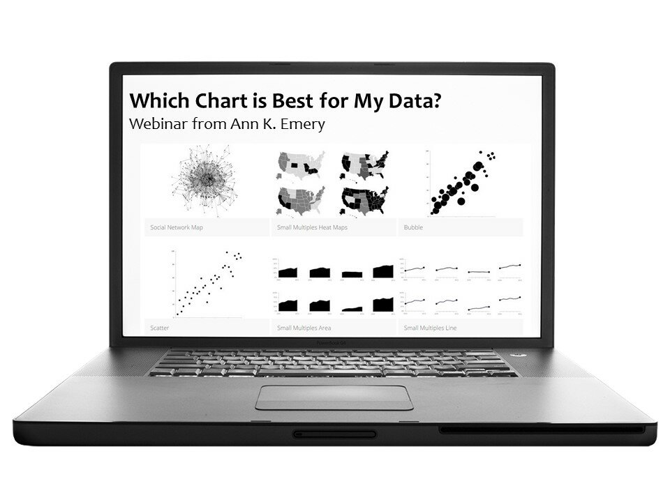
Feel like you’ve exhausted Microsoft Excel’s limited menu of graphing options? Use bar charts and line charts on a regular basis, but feel like there must be a better way to display your data? This webinar is for you! We’ll breeze through data visualization best practices and then dive into the fun stuff: A gallery of 30+ essential charts.

Continue reading →

Public Webinar: Which Chart is Best for My Data? Essential Charts for Researchers and Evaluators

Public Webinar: Which Chart is Best for My Data? Essential Charts for Researchers and Evaluators

Data Visualization Part 2: Essential Charts. We’ll discuss pros, cons, and tools for creating the following charts: line, area, stacked area, bar, clustered bar, stacked bar, diverging stacked bar, panel, small multiples, dot plots, circle charts, unit charts, pictographs, scatter plots, bubble charts, word clouds, photos, icons, diagrams, regular ol’ tables, heat tables, spark lines and spark bars, conditional formatting, tree maps, social network maps, Sankey diagrams, density maps, pin drop maps, histograms, box plots, span charts, bullet charts, infographics, dashboards, and more.

Continue reading →

Situs Togel Terpercaya Slot88 Situs Togel Prize 123 Bo Togel Terpercaya Togel Online Daftar Akun Togel Resmi Toto Macau Toto Togel Situs Togel Terpercaya Togel178 Togel279 Situs Togel Via Pulsa Tanpa Potongan Daftar Togel Via Pulsa Tanpa Potongan Toto Macau