Archive for Visualizing Data - page 3

The Best Visualization Tool of All Time

The Best Visualization Tool of All Time

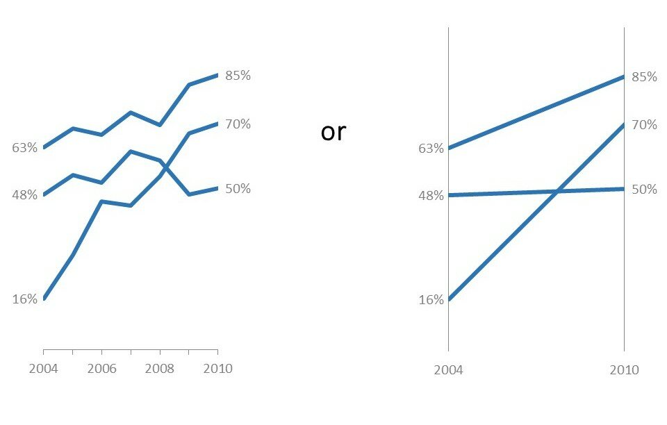
It’s your brain. A few of the million+ decisions your software program can’t make for you: 10. Which chart is best for your data. Yes, I’m well aware of Excel’s Suggested Charts feature. No, don’t even think about it. There’s no substitute for your critical thinking…
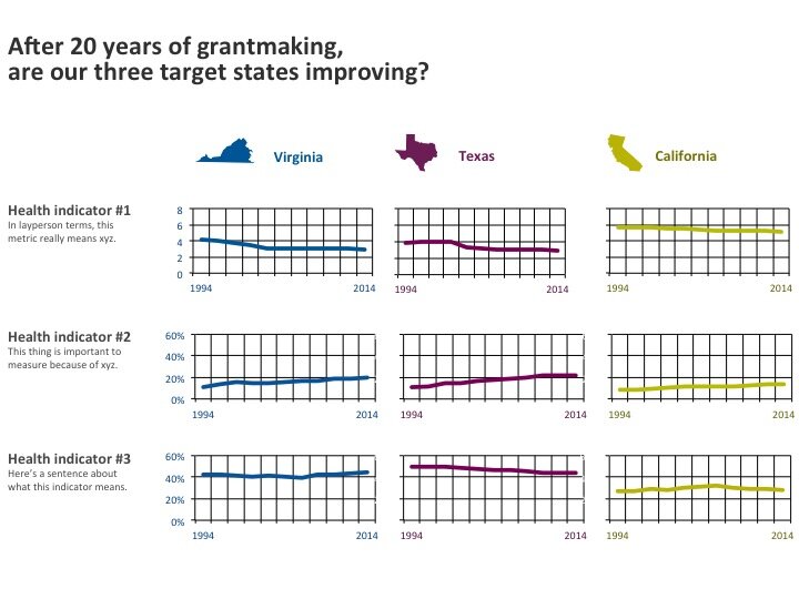
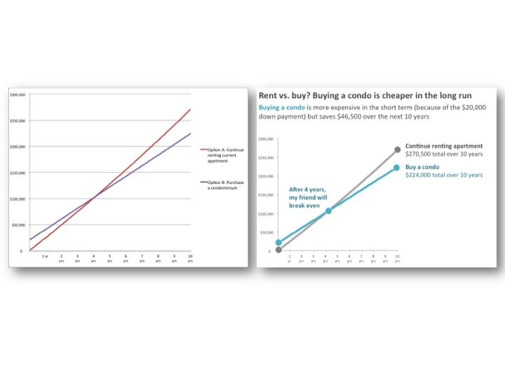
Continue reading →

Disaggregating with Small Multiples

Disaggregating with Small Multiples

Los Angeles, San Francisco, Denver, Buffalo, Indianapolis, Milwaukee, Kampala, DC… it’s been a wonderful few months in the data visualization workshop world!   My favorite part of data visualization workshops? The airports. Kidding. Watching jaws drop when folks are introduced to small multiples layouts for…

Continue reading →

Muted Grid Lines: Small Details, Big Difference

Muted Grid Lines: Small Details, Big Difference

A few posts ago, I showed you this collage of area charts, which could be printed on 8.5 x 11 inch paper and used as a discussion starter at a meeting: This is made-up data, but I share handouts like these at meetings all the…

Continue reading →

Span Charts: When You’ve Only Got the Min and Max

Span Charts: When You’ve Only Got the Min and Max

A few months ago I received a copy of the Chronicle of Philanthropy. An article about nonprofit CEO salaries caught my attention. Let’s zoom in and check out that data table: Nevermind that the data (salary ranges) has nothing to do with the article (turnover)….

Continue reading →

This is What Equidistant Axis Labels Look Like

This is What Equidistant Axis Labels Look Like

Let’s pretend you’re tracking whether friendly reminder messages bring in more responses to your survey. Can you spot the fatal flaw? See it? Go check out the x-axis. Where the heck are Days 5, 6, 7, 12, 13, 14, and 20? (This is where you…

Continue reading →

6 Ideas for Displaying Qualitative Data

6 Ideas for Displaying Qualitative Data

I used to conduct qualitative-heavy research projects pretty much all day every day. Key informant interviews, bellwether interviews, document review, focus groups, you name it… …so I know from personal experience that 99.9% of qualitative reports look like this: Which is fine, unless you want someone…

Continue reading →

How Data Visualization Supports Decision Making

How Data Visualization Supports Decision Making

The only thing I love more than analyzing research data is analyzing personal finance data. In both cases, simple descriptive statistics and basic charts can shine a spotlight on interesting patterns and help people choose their course of action. Not too long ago, a friend…

Continue reading →

At-a-Glance Patterns with Area Charts

At-a-Glance Patterns with Area Charts

First, the best thing I’ve ever written about:   Ann K. Emery: Independent consultant!   I’m taking my data visualization and data analysis interests to the next level. Life is short; spend it well. My goal: To equip you to collect, analyze, and visualize your own…

Continue reading →

From Data Table to Small Multiples in Under 5 Minutes

From Data Table to Small Multiples in Under 5 Minutes

When social scientists like me have lots of data, we tend to put it in tables. There’s nothing wrong with tables. They contain infinite details within a finite and teeny space, and they give the reader freedom to draw his or her own conclusions about which details…

Continue reading →

Who knew dataviz could be so easy? [Guest post by Stephen Alexander]

Who knew dataviz could be so easy? [Guest post by Stephen Alexander]

For the record, I had no clue that data visualization could be easy. As someone who’d spent two years working to understand and improve an organizational dashboard (not to mention an evaluation process), perhaps I should have known better. My assumption, for whatever reason, was…

Continue reading →

Page 3 of 12 1 2 3 4 5 ... Last →

Related Links:

Togel178

Pedetogel

Sabatoto

Togel279

Togel158

Colok178

Novaslot88

Lain-Lain

Partner Links