Ann's Blog Equipping you to collect, analyze, and visualize data - page 12

Eval13: 3000+ evaluators, 800+ sessions, and way too little time to soak it all in

Eval13: 3000+ evaluators, 800+ sessions, and way too little time to soak it all in

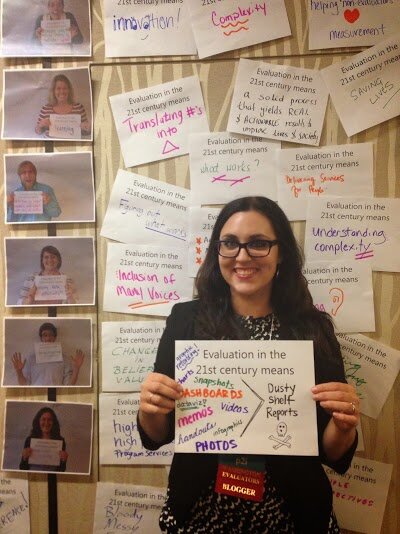
Last week, more than 3000 evaluators descended on my hometown of Washington, DC for the American Evaluation Association’s annual conference. I learned this much + slept this much = rockstar conference. #omgMQP I had the pleasure of spending Monday and Tuesday in Michael Quinn Patton’s…

Continue reading →

Dataviz Challenge #6: Can You Make a Unit Chart?

Dataviz Challenge #6: Can You Make a Unit Chart?

Lately I’ve been feeling let down by summary statistics: the min and max, mean and median, quartiles and standard deviation… They do their job well enough. Summary statistics tell a summary. An aggregate story, bringing all the messy scores together into some sort of cohesion. We…

Continue reading →

Building an Evaluation Culture with Top Ten Lists [Guest post by Corey Newhouse]

Building an Evaluation Culture with Top Ten Lists [Guest post by Corey Newhouse]

Hi, I’m Corey Newhouse, the Founder and Principal of Public Profit. We help public service organizations measure and manage what matters. As the leader of an 8-person evaluation firm, I think often about staff training and common organizational practices. Anyone who has been in the field…

Continue reading →

Dataviz Challenge #5: How to Make a Diverging Stacked Bar Chart in Excel

Dataviz Challenge #5: How to Make a Diverging Stacked Bar Chart in Excel

I’ve been in love with diverging stacked bar charts since I saw Joe Mako’s submission to Cole Nussbaumer’s dataviz challenge last December. Joe made this contest-winning chart. But in Tableau! The amazing but expensive software! Could I ever create one in Excel?! Yes! Luckily I’d…

Continue reading →

Dataviz Challenge #5: Can You Make a Diverging Stacked Bar Chart?

Dataviz Challenge #5: Can You Make a Diverging Stacked Bar Chart?

Last week I shared strategies for improving any chart’s colors. One of the examples was a diverging stacked bar chart: I love stacked bar charts because they’re pretty versatile, and because they’re a great chart for lots of evaluation and survey data. In my example,…

Continue reading →

Page 12 of 32 ← First ... 10 11 12 13 14 ... Last →
Situs Togel Terpercaya Slot88 Situs Togel Prize 123 Bo Togel Terpercaya Togel Online Daftar Akun Togel Resmi Toto Macau Toto Togel Situs Togel Terpercaya Togel178 Togel279 Situs Togel Via Pulsa Tanpa Potongan Daftar Togel Via Pulsa Tanpa Potongan